I haven’t done a post on magazine covers since last August. I tried early this year, but the covers I found were uninspiring. Has the Golden Age of Illustration come to an end, I wondered.*
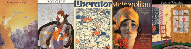
I decided to give it another shot, and I spent a long time looking at covers from March and April 1922. They weren’t bad. Most of them were quite good, in fact. But nothing seemed new or fresh or different.
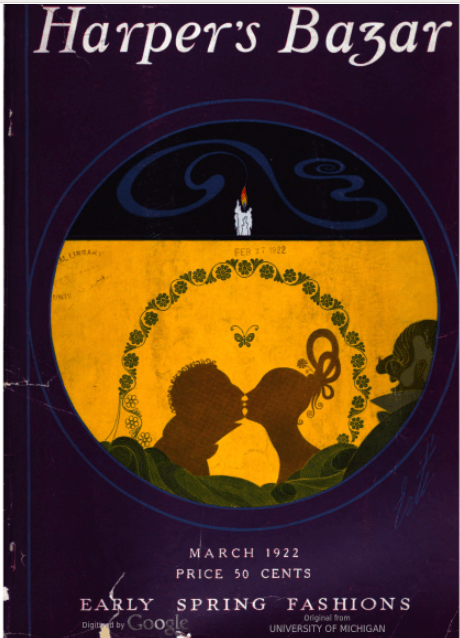
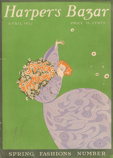
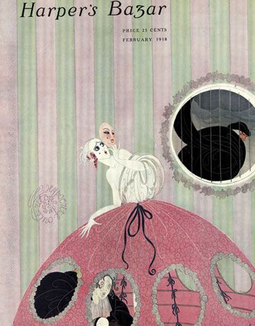
I expect Erté’s Harper’s Bazar covers to be attractive and haunting, but the March one is haunting without being attractive and the April one is attractive without being haunting.**
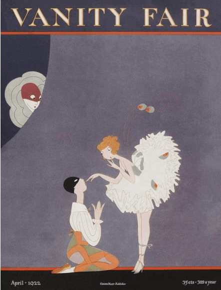
This A. H. Fish Vanity Fair cover was solid but not memorable.
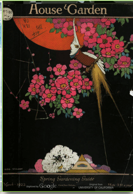
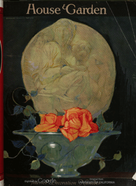
Are these either houses or gardens? I think not, House & Garden!
Okay, maybe I was just in a bad mood. I’ll stop carping now and just tell you what I found.
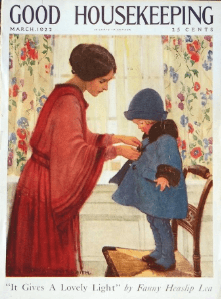
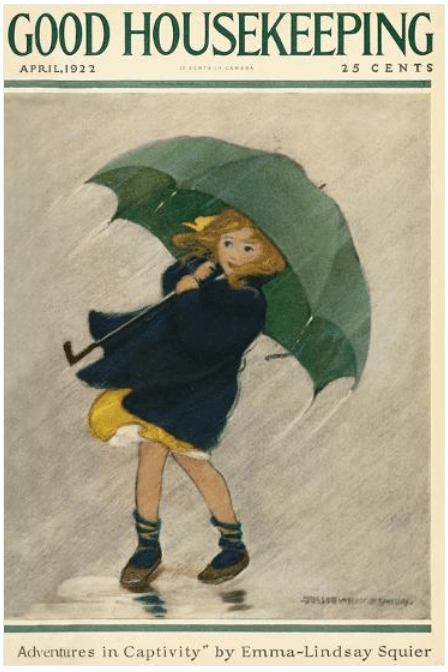
Regular Good Housekeeping cover illustrator Jessie Willcox Smith was her usual competent, family-friendly self.
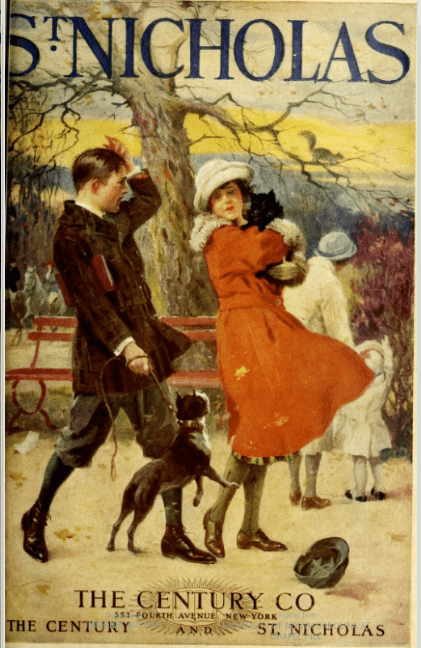
The kids were up to their usual wholesome fun at St. Nicholas.

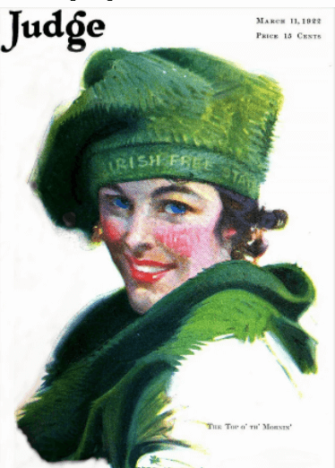
With Ireland newly independent, St. Patrick’s Day celebrations were especially festive.
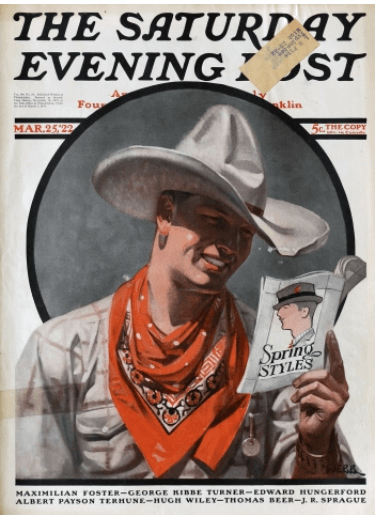
There was a newcomer, Tom Webb, at the Saturday Evening Post,
along with old Post hand Neysa McMein,
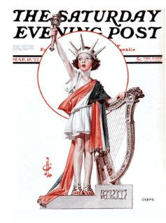
as well as Norman Rockwell, already a SEP veteran at 28.
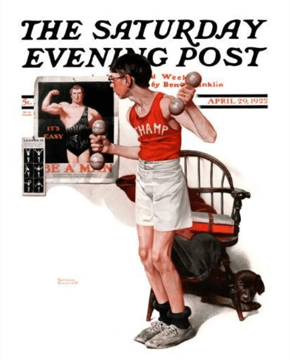
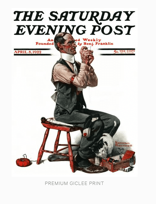
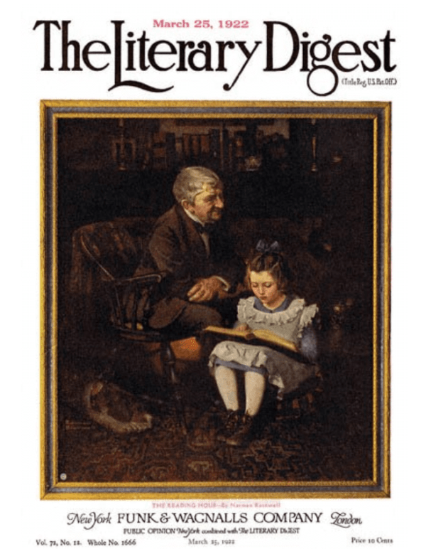
The insanely prolific Rockwell was all over the place in March and April, at The Literary Digest
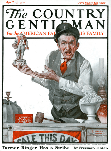
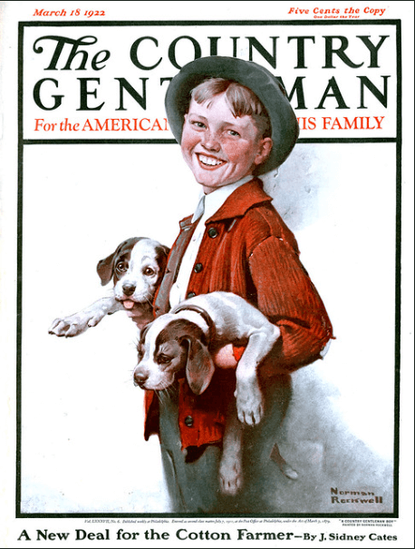
and The Country Gentleman
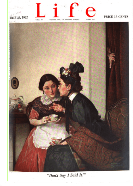
and Life.
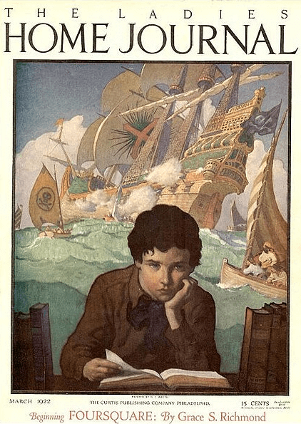
For the Ladies’ Home Journal, N.C. Wyeth (father of Andrew) painted a boy dreaming of stolen loot.
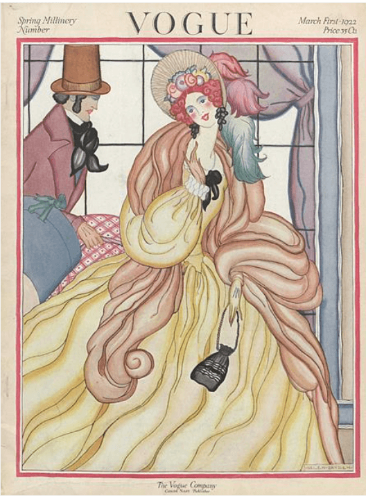
Over at Vogue, a Helen Dryden cover featured an old-timey couple,
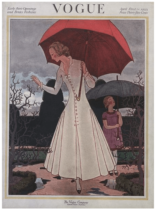
and there were two new-to-me Vogue cover artists, Pierre Brissaud and Henry R. Sutter.***

So, this is all very nice, and if I hadn’t been looking at hundred-year-old magazine covers for over four years I might be impressed. It’s just that there wasn’t anything that hadn’t been done before.
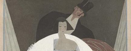
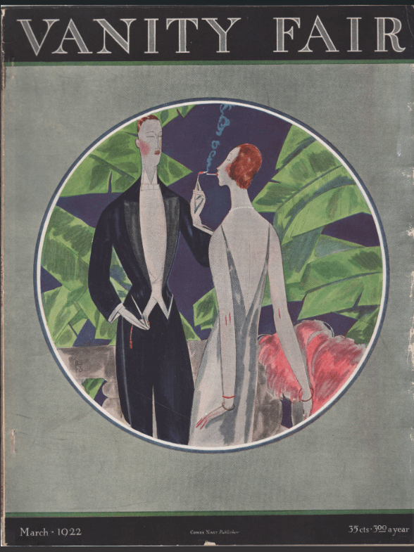
And then I came across this Vanity Fair cover from March 1922, by newcomer Eduardo Garcia Benito, who had arrived in New York from Spain the year before.**** I hadn’t seen anything yet like the sleek, clear lines and bold colors of this cover, which would come to typify Art Deco illustration.*****
And then I took a second look at the other March Vogue cover, by Georges Lepape, which, maybe because of the muted colors, I hadn’t paid particular attention to.
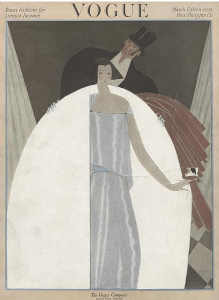
Same minimalist design. Same clear lines. Same boyish silhouette on the woman.
Two years into the decade, the twenties have begun!

*I had already expressed concern about this in my 1915/1920 Magazine Cover Smackdown post.
**Here is an examples of an attractive and haunting Erté cover:
***UPDATE 5/1/2022: I looked into this some more and these both seem to be Vogue debuts. Brissaud went on to be a regular Vogue cover artist. Sutter only did six covers that I could find (i.e. that appear on art.com, which I think has all of them), all in 1922 and 1923. I haven’t been able to find much information about him other than that he lived in Provincetown, Massachusetts.
****This wasn’t Benito’s Condé Nast debut, though. This November 15, 1921, Vogue cover was his first (as far as I can tell) of many for the magazine.

*****I could do without the “Women can smoke too!” message, though.

You’re a harsh critic, Mary Grace, I rather like the House & Garden offerings! You are right, though, you can feel Decomania rumbling from the wings with the EGB and GL covers. P
LikeLiked by 2 people
I like the House & Garden offerings too, actually. It’s just that the best of the era rises to such a high standard that mere excellence doesn’t measure up. Or just, as I said, that I was cranky!
I enjoyed perusing your blog and even found a Vogue cover there!
LikeLiked by 1 person
I’ll select Webb’s fashion cowboy. Gave me a smile, but I do like the minimalist thing in your selections.
LikeLiked by 1 person
I like the cowboy cover too. Webb seems like a natural for the Saturday Evening Post, but he only did six covers for them, between 1922 and 1937.
LikeLiked by 2 people