The people have spoken! And the people, it turns out, like athletic, adventurous women and hate scantily clad women.
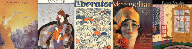
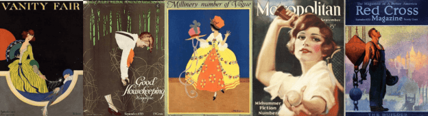
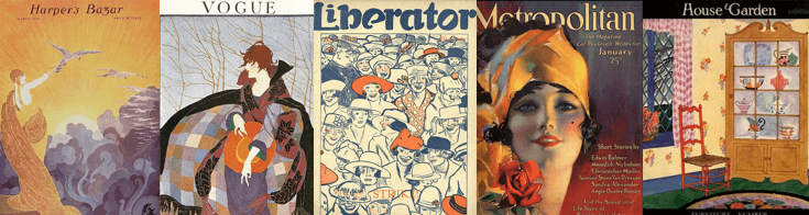
Let’s back up a minute. In case you haven’t been following along, in my last blog post I asked the people to vote on whether 14 magazines (and two mismatched pairs) had better covers in 1915 or 1920. This was in the context of me being a 1920 crank going on about how things were better in the 1910s. But enough with the explanation…you can check it out yourself.
On to the winners:
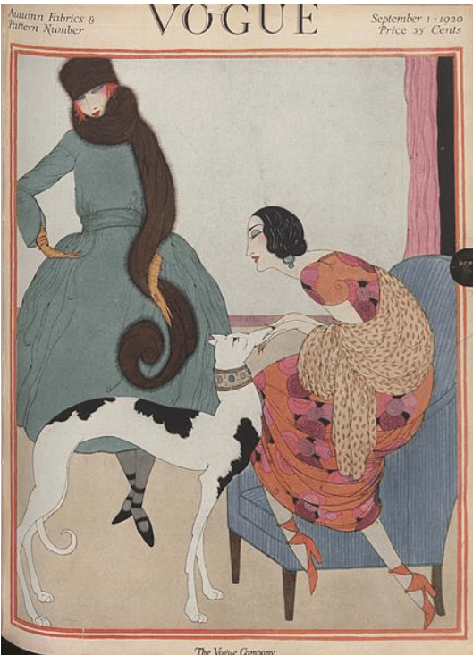
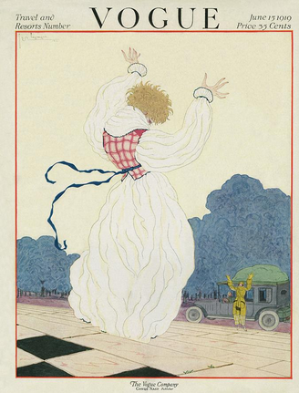
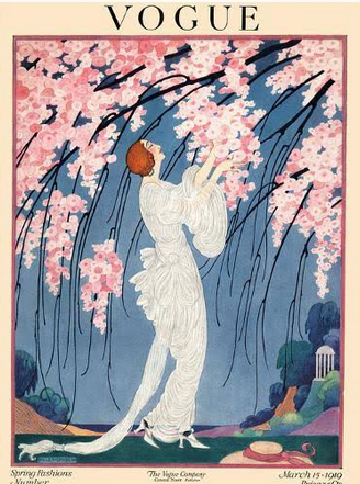
1. Vogue

Helen Dryden, September 15, 1915
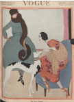
Helen Dryden, September 1, 1920
This is the first of several matchups where an artist faces off against him/herself. Dryden is a favorite of mine, previously featured in my posts on Ten 1919 Illustrators I’m Thankful For and Five Inspiring Women of 1919. The winner, which also got my vote, is Dryden’s colorful 1915 cover, which bested her uncharacteristically subdued 1920 cover with 58% of the vote.
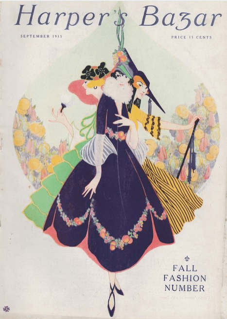
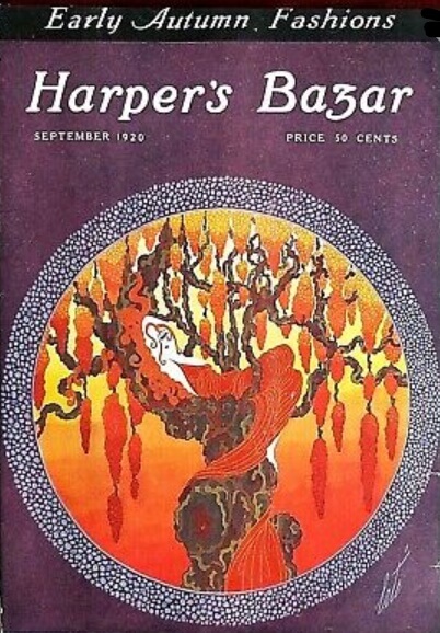
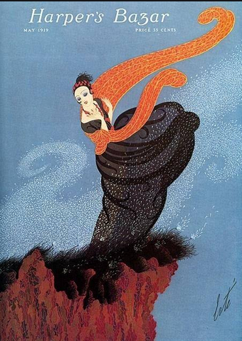
2. Harper’s Bazar

Erté, September 1915

Erté, September 1920
Another self-matchup, Erté vs. Erté.* This was inevitable, because Erté, who was one of the Ten 1918 People I’m Thankful For, was Harper’s Bazar’s regular cover artist from 1915 to 1936. I’m thankful that I have a decade and a half of his illustrations to look forward to, but his October 1920 cover wasn’t one of my favorites. Readers agreed, with the 1915 cover winning 59% of the vote.
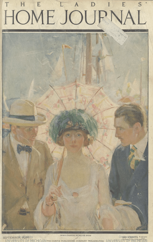
3. Ladies’ Home Journal
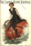
Lester Ralph, September 1915

Walter Biggs, September 1920
This boring vs. weird matchup featured Leslie Ralph’s woman sitting on what looks like a German naval mine vs. Walter Biggs’ popular parasol-carrying woman. I was of two minds here but ended up going for the 1920 cover because at least no one was about to blow up. Readers are made of sterner stuff than I am, though, and the 1915 cover won 71% of the vote.
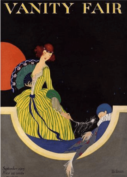
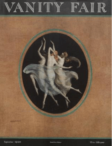
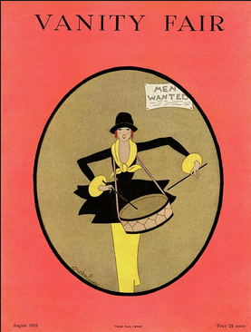
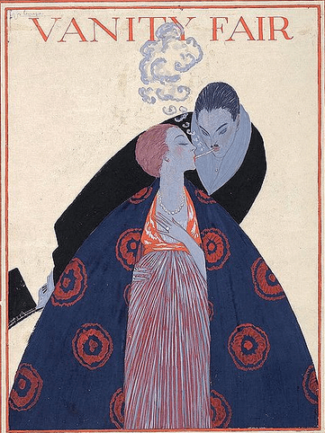
4. Vanity Fair
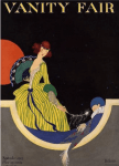
Rita Senger, September 1915

Warren Davis, September 1920
Rita Senger’s 1915 Vanity Fair cover is my favorite of the bunch, winning my enthusiastic vote against Warren Davis’ frolicking naked women. I admired the first Warren Davis cover I saw, way back toward the beginning of this blog, but I soured on him when I learned that drawing naked women was the only thing he ever did. Readers shared my taste, giving Senger a lopsided 91% victory.
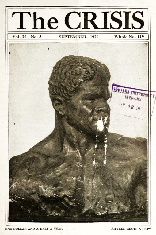
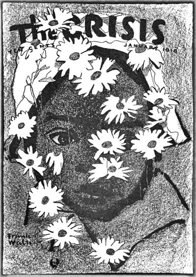
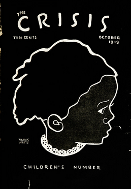
5. The Crisis
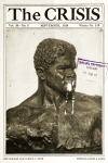
Sculpture by C. Matey, September 1915

Unknown artist, September 1920
I was disappointed that both of these covers featured photographs, as opposed to, say, a Frank Walts drawing or a William Edouard Scott painting. I voted, with mixed feelings, for the 1920 cover featuring a sculpture by the mysterious (or, at least, not easily Googleable) C. Matey, which led the polls with 57% of the vote.
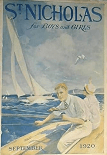
6. St. Nicholas

Charles Livingston Bull, September 1920

Norman Price, September 1915
If I could jump into one of these covers, Mary Poppins-style, I’d definitely opt for sailing over watching dangerous motorcycle escapades (both of which apparently require a necktie). But as a cover I went for the eye-popping red and the action of the 1915 cover. I was in a minority here; 55% chose sailing.
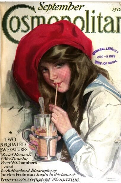
7. Cosmopolitan

Harrison Fisher, September 1915

Harrison Fisher, September 1920
A Harrison Fisher vs. Harrison Fisher faceoff, with similar young-woman-drinking-something themes. The one with the dog (title: “You Beauty!”) struck me as a bit unsanitary, so (putting aside my resentment over just happening upon it after spending an hour searching for images of women drinking through straws for my Are You H.L. Mencken and George Jean Nathan’s Ideal Woman? quiz) I went with the 1915 cover. 62% of readers agreed.
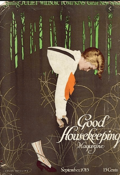
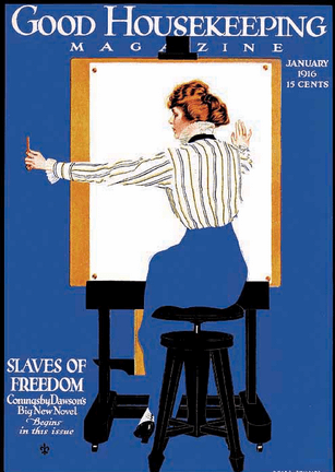
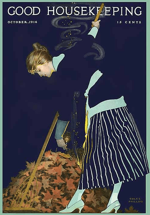
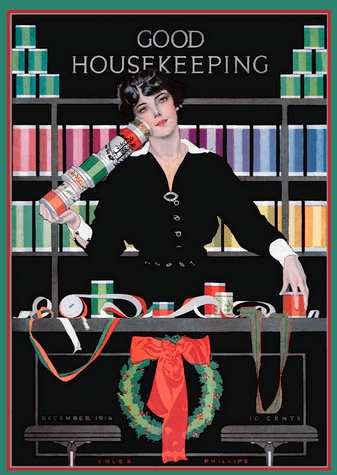
8. Good Housekeeping

Coles Phillips, September 1915
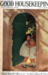
Jessie Willcox Smith, September 1920
As I’ve repeatedly mentioned, I adore Coles Phillips, who was Good Housekeeping’s sole cover illustrator for a two-year stretch in the 1910s.** If I had known about him two years ago, My Sad Search for 1918 Love might have ended differently. I don’t adore Jessie Willcox Smith, who was at the vanguard of the cutesification of magazine art (although I do adore her illustration from At the Back of the North Wind featured in the 1919 children’s books holiday shopping guide and her Good Housekeeping New Year’s 1918 cover). 83% of voters agreed with me.***
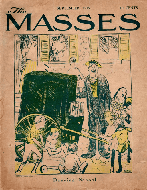
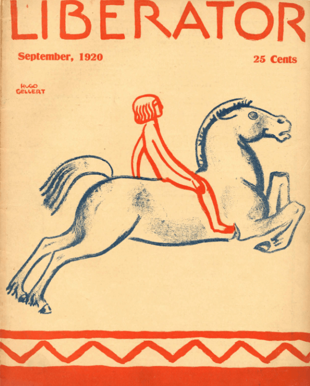
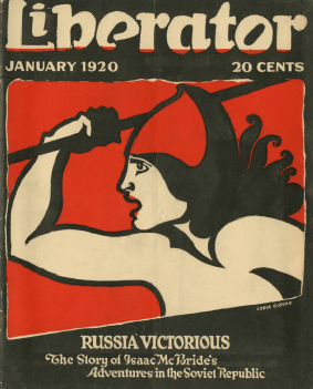
9. The Masses/The Liberator

Cornelia Barnes, September 1915
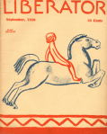
Hugo Gellert, September 1920
As I noted in my previous post, The Liberator arose in the ashes of The Masses, which closed after staff members were charged with conspiring to obstruct conscription. I’m a fan of Cornelia Barns, who drew a proto-New Yorker cartoon I loved, and an even bigger fan of Hugo Gellert and his wonderful covers for The Liberator (including its inaugural issue). This isn’t my favorite Gellert, though, and I ended up voting for Barnes. 57% of voters agreed.
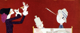
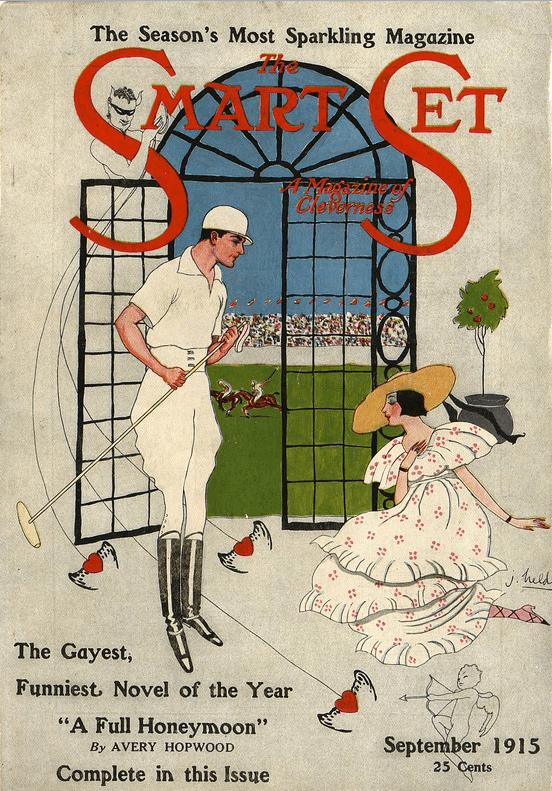
10. The Smart Set

John Held Jr., September 1915

Archie Gunn, September 1920
The Smart Set is one of the few magazines where what’s inside is consistently better than what’s on the cover. I did like John Held Jr.’s cheery 1915 polo cover; less so the people in the boat who you just know are racist. A lopsided 86% of readers agreed.
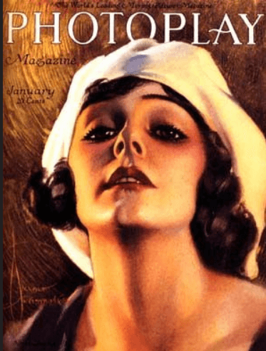
11. Photoplay

Unknown illustrator, September 1915

Rolf Armstrong, September 1920
Movie star vs. movie star. I could have gone for either one of these, and in choosing the 1920 cover I was perhaps slightly biased by my fondness for Rolf Armstrong, although this isn’t one of my favorites.**** I was in the minority here, with 55% of readers choosing the 1915 cover by an unknown illustrator. (I originally credited the 1915 illustration to Anita Stewart, who, an alert reader pointed out, is actually the subject. Kicking myself!)
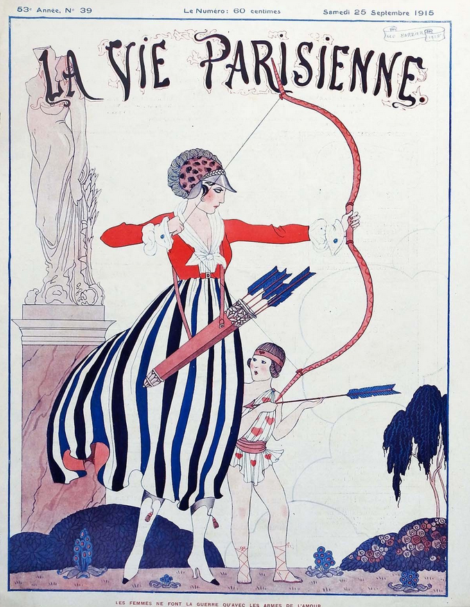
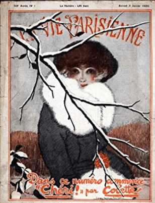
12. La Vie Parisienne
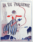
Unknown artist, September 25, 1915
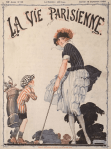
Unknown artist, September 18, 1920
I lucked out in having two La Vie Parisienne covers that are suitable for a family blog. I prefer the clear lines of the 1915 archer, and so did a whopping 90% of readers.
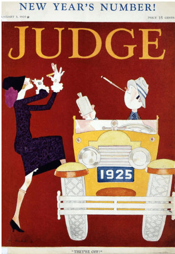
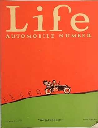
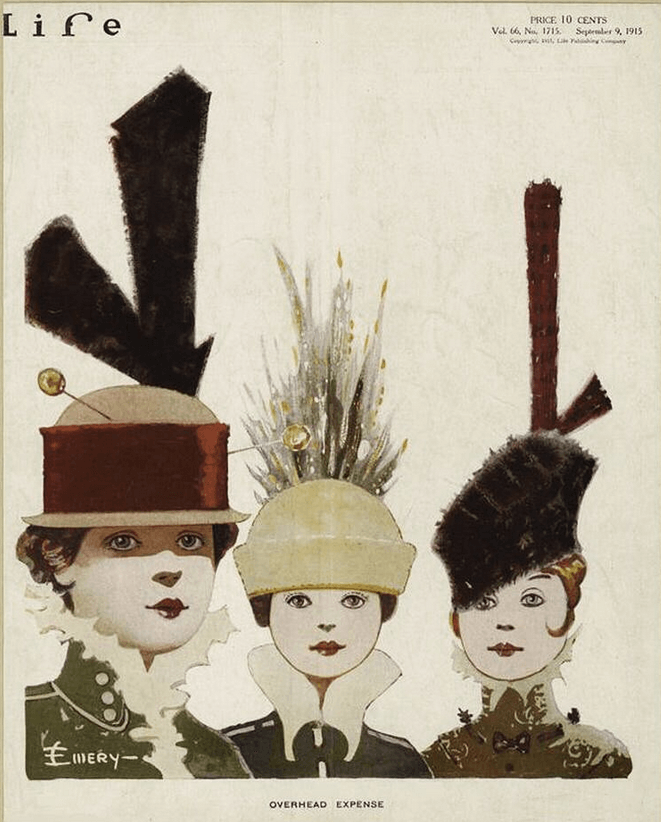
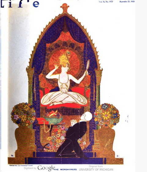
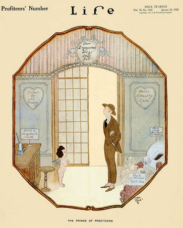
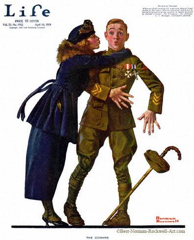
13. Life

Emery, September 8, 1915

Rea Irvin, September 23, 1920
I’m a big fan of future New Yorker illustrator Rea Irvin, but not so much of his 1920 Life cover (although it bears closer scrutiny since the picture seems to be embroidered). I have no idea who Emery is, but his or her whimsical take on hat fashions is a lot of fun. 76% of readers agreed.
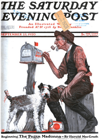
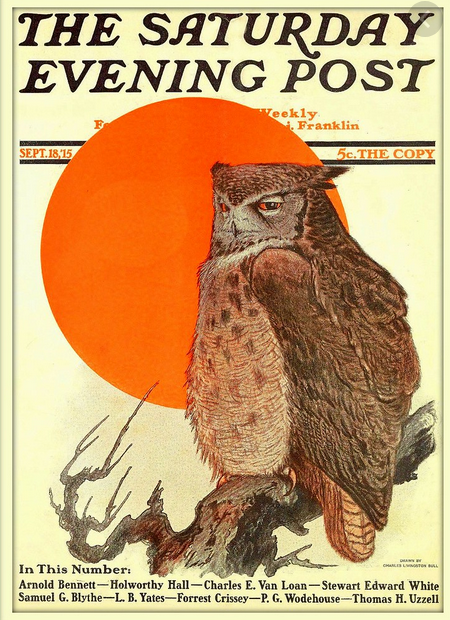
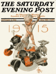
14. Saturday Evening Post

Charles Livingston Bull, September 18, 1915

Alfred E. Orr, September 25, 1920
I had second thoughts about some of my choices, none more than this one. I voted for Alfred E. Orr’s man painting a mailbox when clearly the correct choice is Charles Livingston Bull’s owl. A consequential choice, since there was a dead heat here.
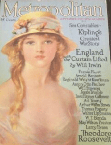
15. Metropolitan

Edna Crompton, September 1920

Unknown artist, September 1915
Despite my 1910s leanings, I’m not blind to the ways that the 1920s are better, including more women being portrayed as being physically active as opposed to standing around with their clothes falling off. 90% of readers agreed.
16. The Best of the Rest

Gerrit Beneker, September 1920

Unknown artist, September 1915
For the last matchup, I paired up two covers that didn’t have a counterpart in the other year but that I couldn’t bear to leave out. My favorite, and that of 75% of readers, was Gerrit Beneker’s 1920 builder on the cover of Red Cross (the magazine’s second to last issue).
And the winning cover is…
Rita Senger, September 1915
I’m new at this polling business, and if I had it to do again (which I no doubt will, given how much fun it was this time) I would allow everyone to vote for their favorite cover of all. As it is, I’ll have to go with the cover that had the highest vote percentage. This isn’t really fair because it may just reflect the weakness of the competition, but so be it.
All caveats aside, I’m delighted to announce that the winner is Rita Senger’s wonderful Vanity Fair cover, which, as noted, is also my favorite. It edged out the 1915 La Vie Parisienne cover by a few tenths of a percentage point. Next time I write about illustrators I love, I’m going to write about Senger.
And the winning year is…
J.C Leyendecker
1915 was the overwhelming winner, beating out 1920 in twelve of the matchups, with three victories for 1920 and one tie. Interestingly, given that it was my grousing about the decline of magazine illustration that spurred the contest, I voted for 1920 six times, twice as often as the average reader.
So it’s been officially, objectively proven: the 1910s rule!
And the winning reader is…

…Allison Silberberg, who has received a free copy of Deborah Kalb’s wonderful middle-grade novel George Washington and the Return of the Magic Hat. Allison’s favorite cover is the Red Cross “The Builder” cover, which makes a lot of sense given the former Alexandria, Virginia, mayor’s commitment to building communities. You can find Allison on Facebook here and on Twitter here.
And the winning new (to me) blogging technology is…
Readership during the week the Magazine Cover Smackdown was published shattered previous records, even when taking into account some iffy botlike behavior on the day before publication. So clearly readers like polls! Judging from the low number of votes as a percentage of views, though, readers are not as fond of voting in polls as they are of reading them.
That’s fine! It’s just a blog poll! It’s not like the future of America is at stake!
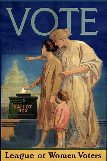
Which is not something that can be said for the other election that’s going on right now. So, as we celebrate the hundredth anniversary of women’s suffrage,***** make sure to

League of Women Voters poster, 1920

*Estimated amount of time that I have spent over the course of this blog putting the accent mark in Erté’s name (or, rather, pseudonym): two hours.
**For more Fadeaway Girls, check out my Pinterest board.
***Not that I’m judging you 17 percenters. In fairness to Smith, this is a beautifully illustrated cover—I love the green doors and the shadows.
****That’s Armstrong’s Metropolitan cover on the blog banner, unless you’re reading this in the future when I have updated the banner, in which case here’s the old one, featuring 1919 covers. It was a thing of beauty (future me says), and I miss it so much!

*****Of course, it would take decades more of struggle before African-American men and women’s right to vote was fully honored throughout the country.