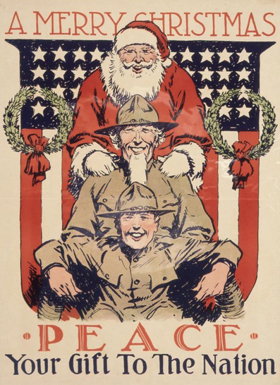
The thing I miss most about reading ONLY as if I were living 100 years ago is the Best and Worst posts. I just don’t do enough hundred-year-old reading anymore to determine what’s the best magazine or short story or woman swimming with a red scarf on her head of the month. (Well, I could probably do that last one.) But then it dawned on me that I can judge to my heart’s content if I just narrow the field. To, say, advertising, which I vowed to write about more often anyway after my only 2020 post on the topic ended up being the most popular post of the year. (UPDATE 2/6/2021: Oh, wait, third-place post My Dream 1920 Summer Vacation was also about ads.)
So, having looked through the Ladies’ Home Journal and Good Housekeeping, I present you with the best, worst, and various other superlatives of January 2021 advertising.
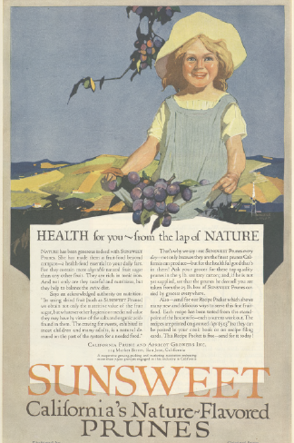
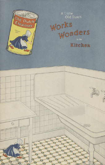
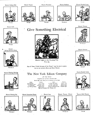
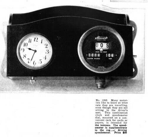
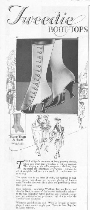
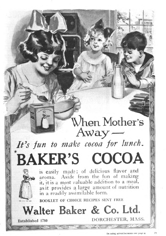
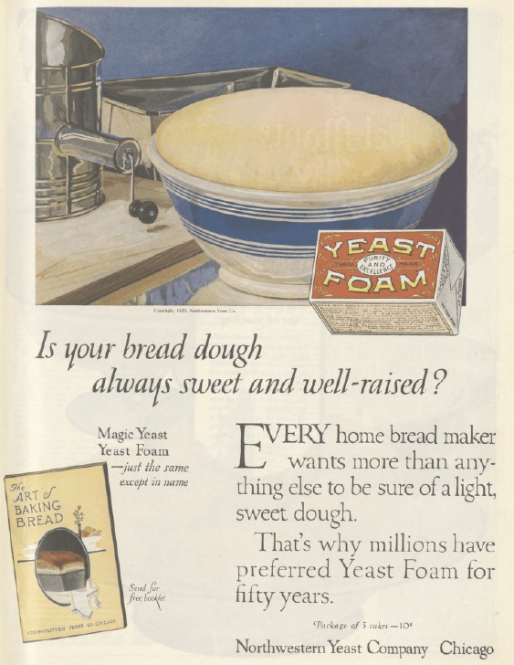
Cutest Old-Timey Product
Having this in the kitchen would ALMOST be worth the incredible hassle of cooking with it.
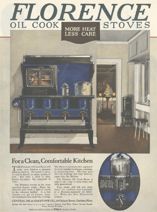
Ladies’ Home Journal
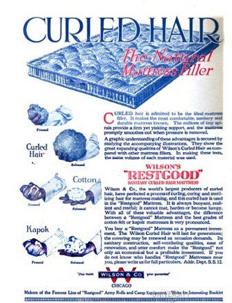
Least Cute Old-Timey Product
We can all be thankful that we don’t live in a world where linoleum rugs are a thing.
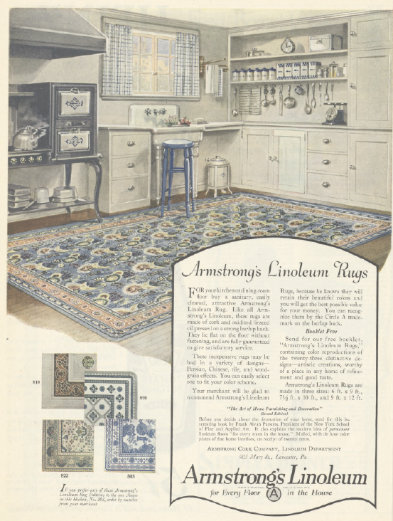
Ladies’ Home Journal
Ladies’ Home Journal
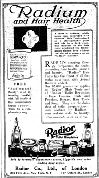
Worst Product Name
Merely dumb-sounding
Ladies’ Home Journal
and incomprehensible
Ladies’ Home Journal
lose out to pure evil.*
Good Housekeeping
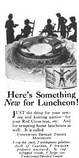
Least Convincing Advertising Claim
There are plenty of dubious claims, like this
Ladies’ Home Journal
and this
Good Housekeeping
and this,
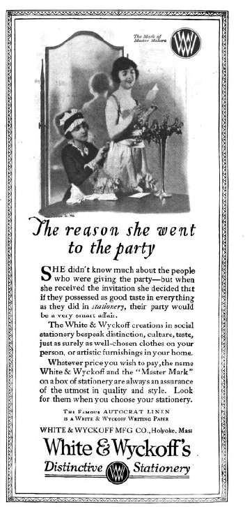
Good Housekeeping
which, if you can’t read the small print, is about a woman who decides to go to a party based solely on the quality of the inviter’s stationery. Strong contestants all, but I’m taking an Italian class at the moment, and one of my classmates recently sent us pictures of his Italian grandma’s gnocci preparations,
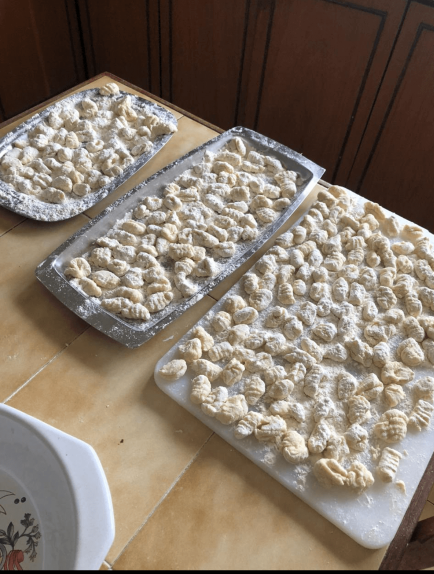

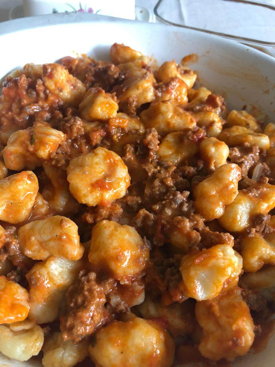
Karl Robert Schaberg
so I know whereof I speak when I award top honors in this category to
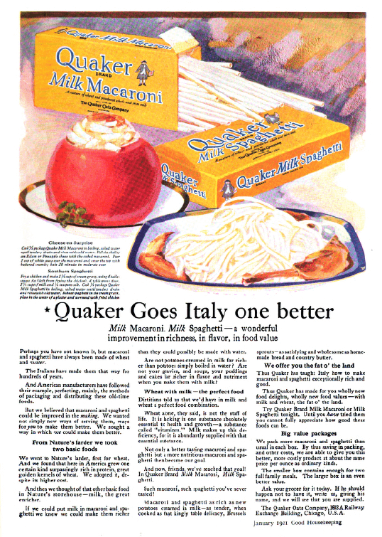
Good Housekeeping
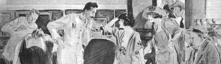
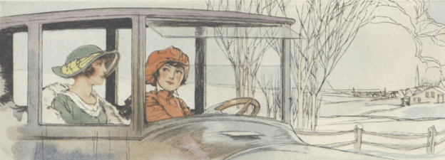
Most Absorbing Narrative
Helen and her friend muse about men, gas mileage,** and socialism on their way to pick up Helen’s husband Harry at the station.
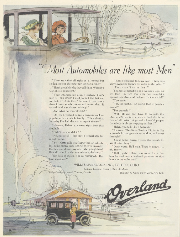
Ladies’ Home Journal
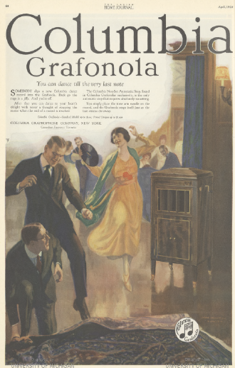
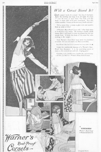
Most Distinctive Advertising Trend
Trompe-l’oeil curling pages were apparently all the rage.
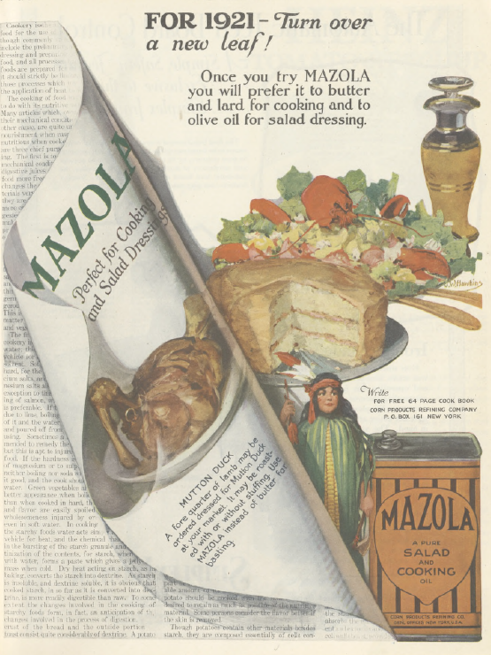
Ladies’ Home Journal
Good Housekeeping
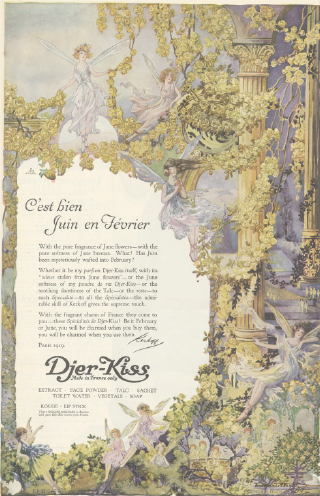
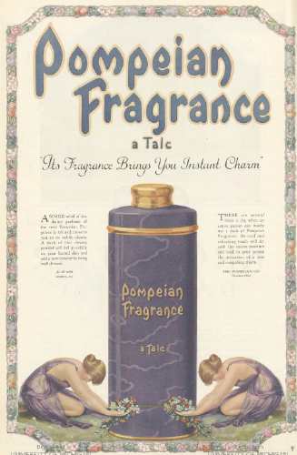
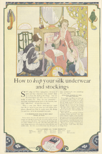
Most Retro Ad Design
As I’ve mentioned, the perfume industry hasn’t gotten the memo that Art Nouveau*** is over.
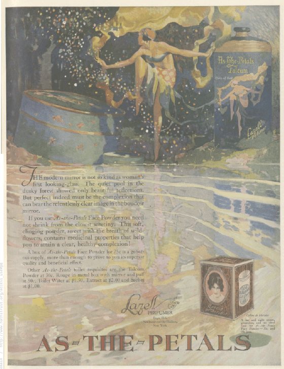
Ladies’ Home Journal
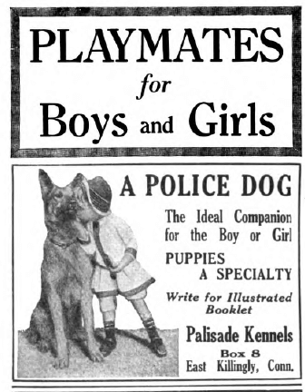
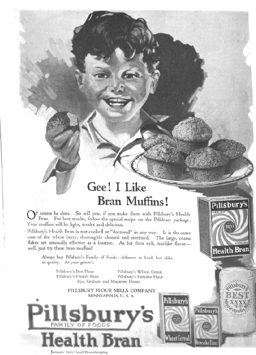
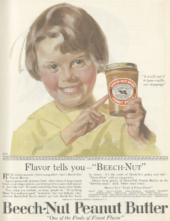
Least Cute Kid
In this always-competitive category, here are the runners-up
Ladies’ Home Journal
Good Housekeeping
and the winner.
Good Housekeeping
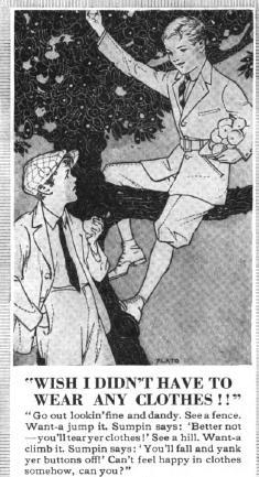
Least Appropriate Literary Reference
Because what says “let’s go whitewash some fences!” like a necktie?
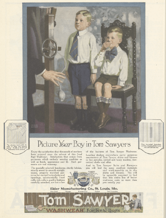
Ladies’ Home Journal
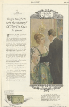
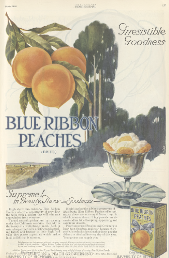
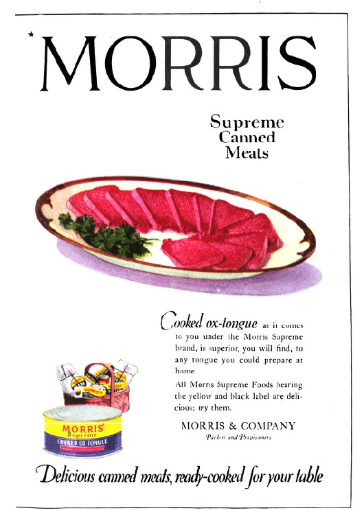
Most Diet-Busting Ad
If I hadn’t been so hungry when I was judging this category, the prize probably would have gone to this,****
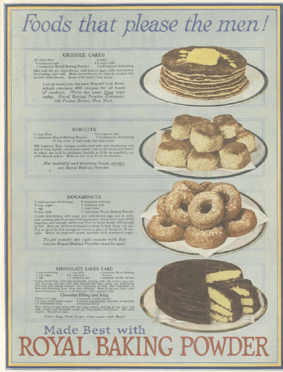
Ladies’ Home Journal
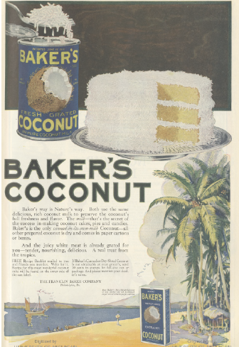
but after seeing this
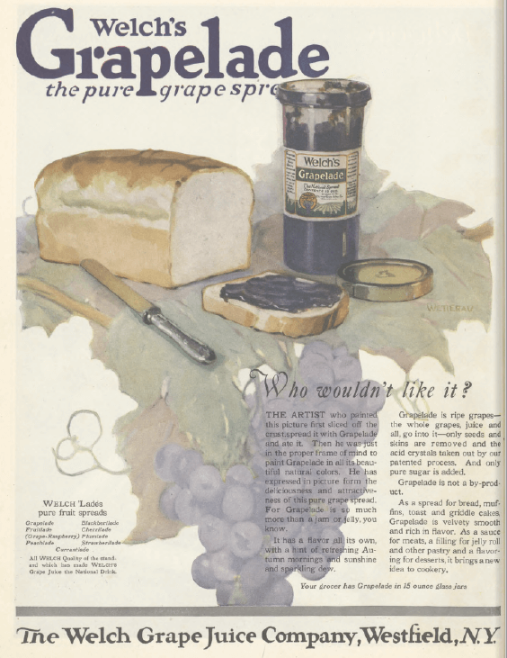
Ladies’ Home Journal
I yelled out desperately to my husband, who had just returned from the grocery store, asking him if he had bought any bread. Which, given that we had vowed to abstain from it, he hadn’t. All I could think about was a peanut butter and jelly sandwich, and my Swedish-inspired smoked salmon salad,
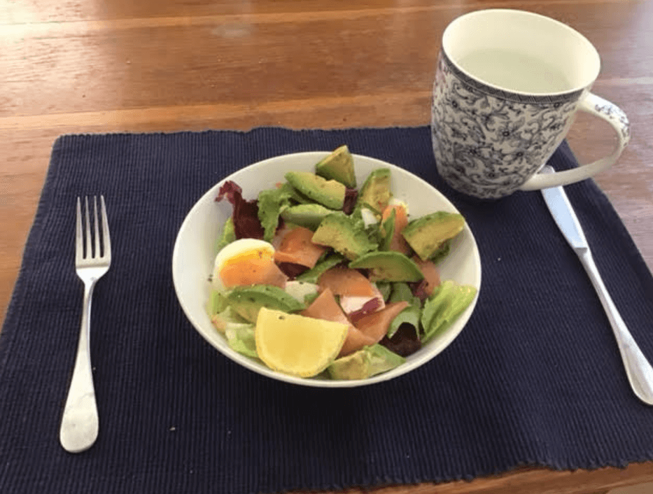
which I normally love, just wasn’t doing it for me. This didn’t help.
Ladies’ Home Journal
If you needed proof that advertising, even 100-year-old advertising, works, there it is.
Least Diet-Busting Ad
Good Housekeeping
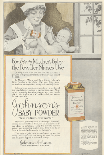
Creepiest Ad
Creepiness was a surprisingly popular advertising trend a hundred years ago. I first took note of it in my least popular post of 2018. It’s still with us in the form of these corn medicine drop people
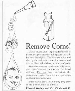
Ladies’ Home Journal
and, the winner, this giant wall baby.*****
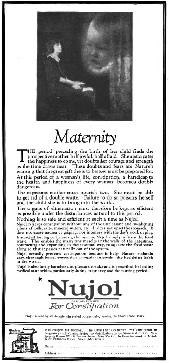
Good Housekeeping
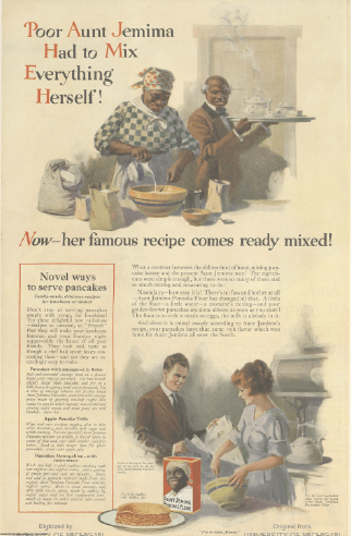
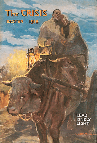
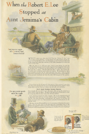
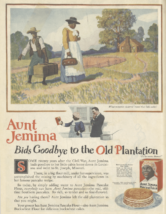
Best Good Riddance
I’ve been meaning to do a post on Aunt Jemima for months, and have done a huge amount of research, which is a sign I’ll probably never get to it. So I’ll just say that after years of ads where she’s constantly ordered to make pancakes as an enslaved person
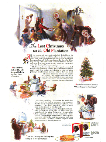
Good Housekeeping, December 1919
and hassled for free pancakes even after emancipation,
Ladies’ Home Journal, January 1920
I’m pleased to see her heading up north to finally earn some money.******
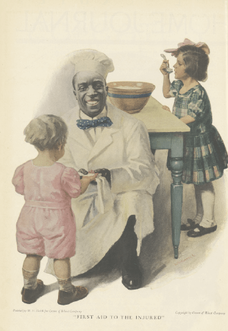
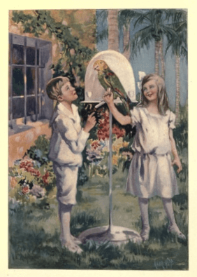
Best Multiculturalism
This isn’t a highly competitive category, with only one contestant featuring people of color in non-servant roles. Here it is:
Ladies’ Home Journal
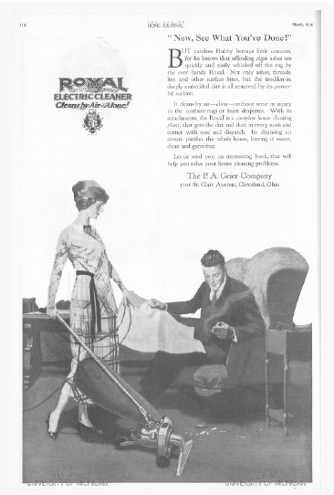
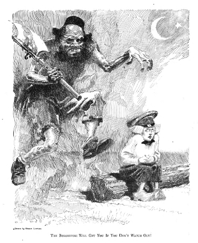
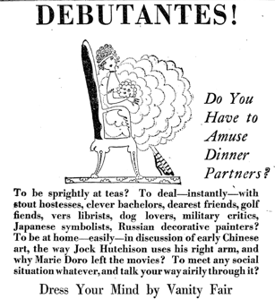
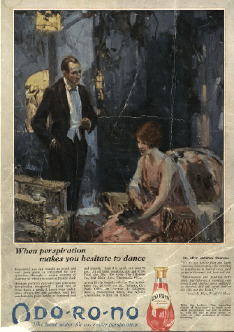
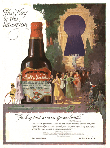
Most Revolutionary Ad
There I was, flipping idly through the Ladies’ Home Journal, when I saw this.
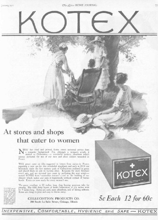
Ladies’ Home Journal
“Wait, what?” I said. I had never seen an ad for a sanitary product in a 100-year-old magazine before. Deodorant was about as personal as advertising got.
Ladies’ Home Journal
I did some research and found that, while disposable sanitary napkins had been around in various forms since the 1880s, this was indeed the first advertisement for them in a major magazine and, therefore, their debut as a large-scale commercial product. The ad, which never explains exactly what these newfangled things are for, says that they’re made of a material that was first used for soldiers’ bandages during the war. This struck me as probably bogus but turned out to be true.
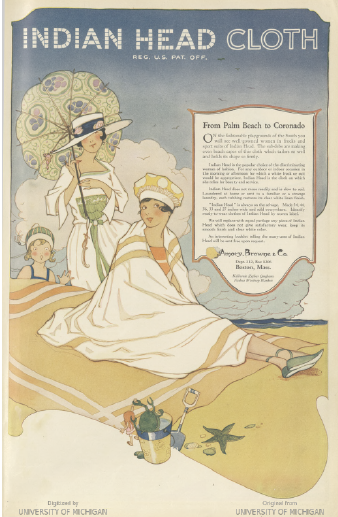
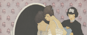
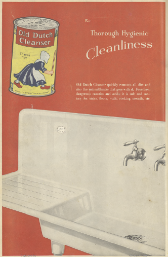
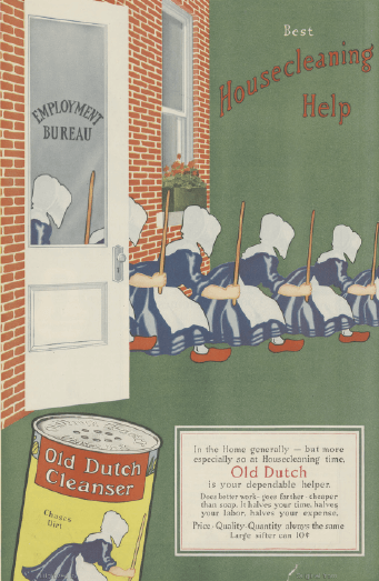
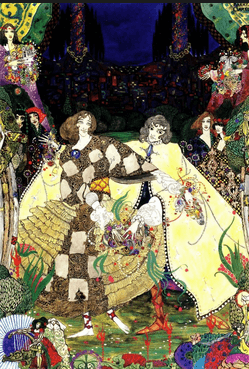
Best Ad Artistry
I read an interview with Lionel Messi once where someone asked him who the best player in soccer was. He said that there were himself and Ronaldo and then there was everyone else, and he went on to rank-order everyone else. In 1920s advertising terms, that would be Old Dutch Cleanser and Indian Head cloth. Old Dutch Cleanser is absent from LHJ and GH this month, so the winner by forfeit is
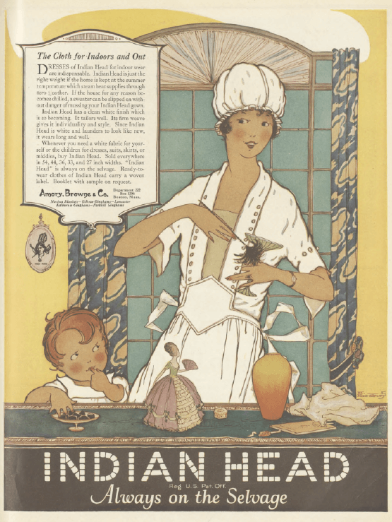
Ladies’ Home Journal
On to February!

*Actually there was a worse product name, which was (unintentionally) an ethnic slur, but it was disqualified from inclusion for that reason.
**Twenty-five miles per gallon!
***Which I love, don’t get me wrong. Missing the heyday of Art Nouveau is one of my greatest regrets about the timing of this project, up there with coming along after Jessie Willcox Smith replaced Coles Phillips as Good Housekeeping’s regular cover artist.
****Unless I DQ’d it out of annoyance over its sexism.
*****In fairness, Nujol also has one of the best ads ever:
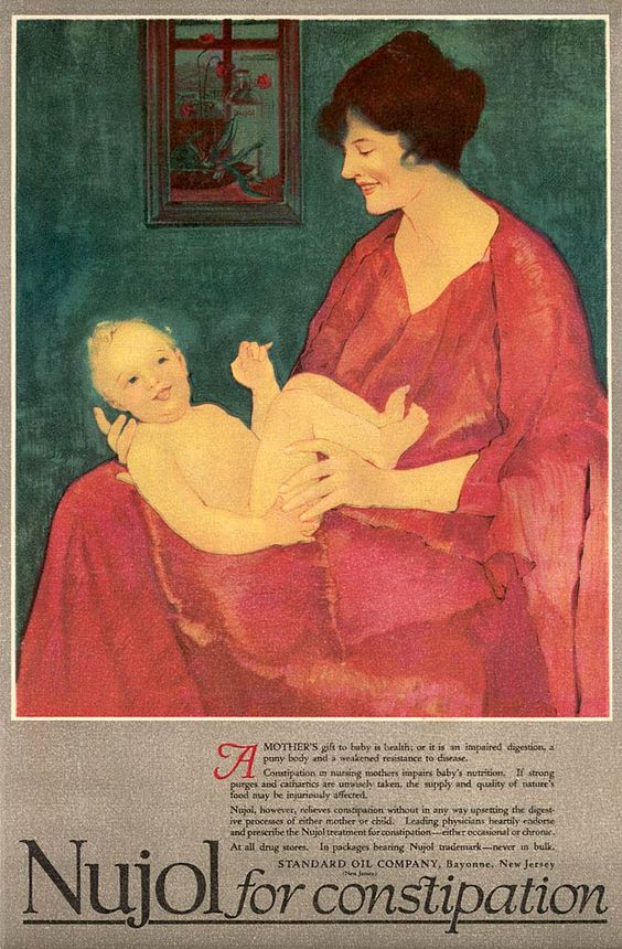
Woman’s Home Companion, January 1918
******Of course I realize that the whole thing is still highly problematic.